🕒 Reading time: 3 minutes


How I Redesigned the Homepage for One of India’s Top Insurance Brands
In 2021, I got the chance to work on a complete redesign of the homepage for
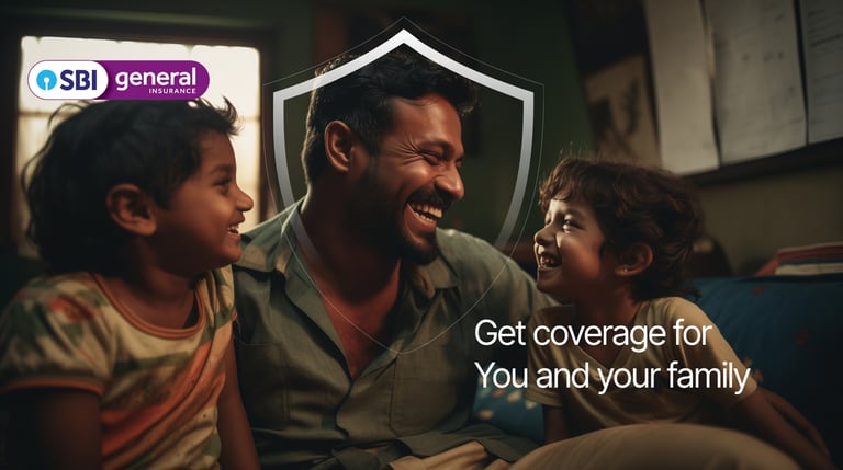
SBI General Insurance - a joint venture originally between the State Bank of India and Insurance Australia Group. It’s one of India’s leading general insurance providers, offering everything from health and motor to rural and commercial insurance.
At the time, I was working as a Design Manager and Creative Designer at Mantra Labs. For this project, I collaborated with a small but strong team: 2 designers and 1 researcher.
Let's get start..
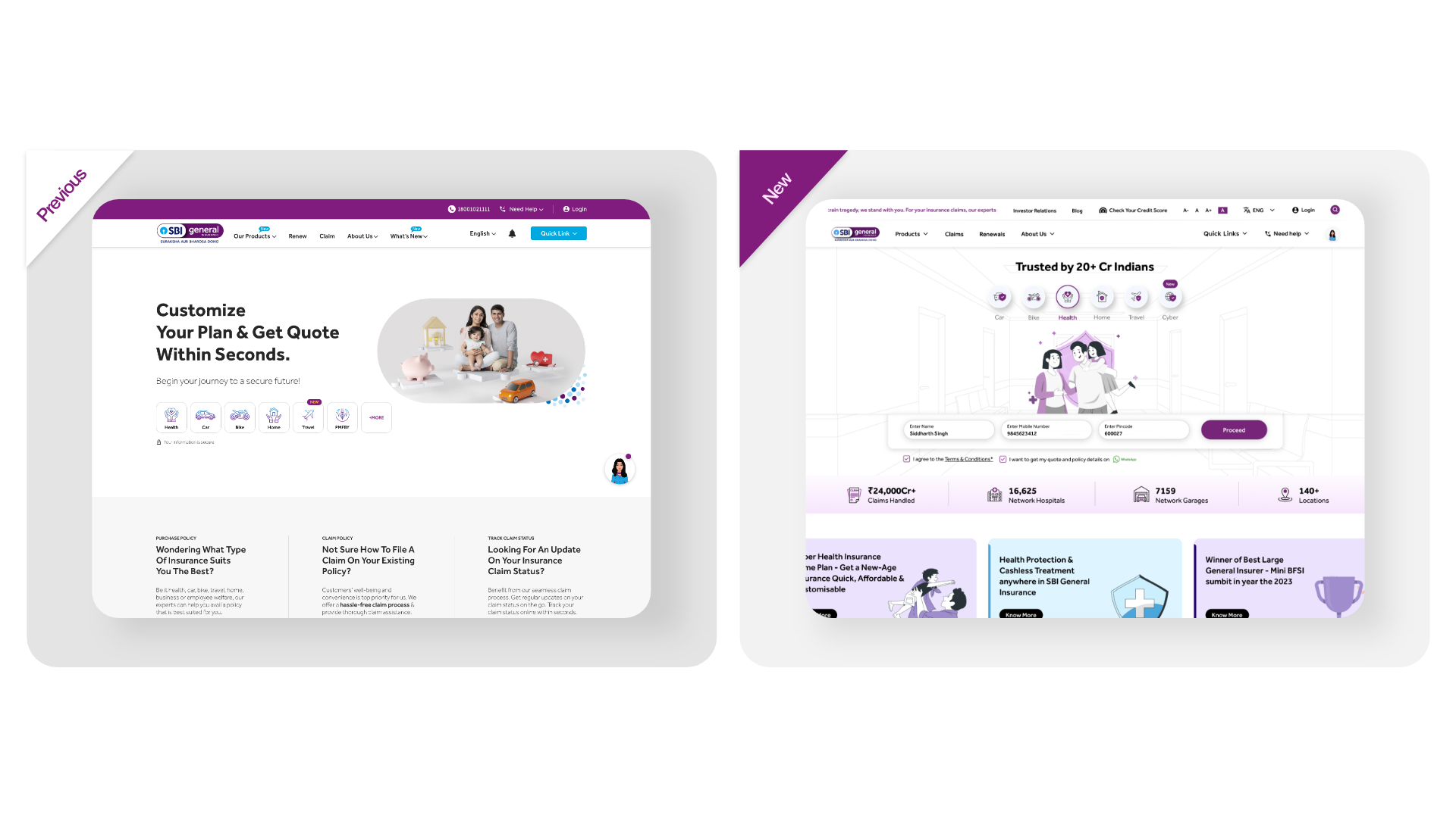
When the brief came in, I assumed it would be just another homepage revamp maybe change a few banners, update some colors, clean up the layout. In insurance, that’s usually the case.
But I was wrong.
This wasn’t about pixels. It was about transforming how millions of Indians first experience a complex, trust-heavy product like insurance.
I Thought It Was Just a Banner Job..
SBI General isn’t a startup.
It’s a legacy brand with a strong identity and multiple stakeholders:
🗣 Marketing wanted better lead conversion from campaigns.
💡 Branding focused on trust and heritage.
📞 Sales needed new products to get visibility.
✍ Compliance wanted legal clarity and proper disclosures.
👋 Support wanted fewer confused calls from users.
Every department had a different priority and all of them wanted a piece of the homepage.
So we have to make proper system otherwise it will be hard. also we have make sure fundamental right. So we plan things accordingly:
▶️ Interviewed stakeholders from every team.
▶️ Ran user studies over phone, video calls, and chat.
▶️ Analysed customer feedback from social media, emails, and support tickets.
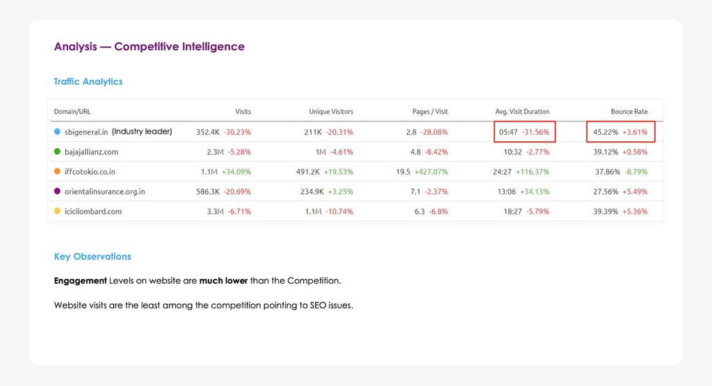
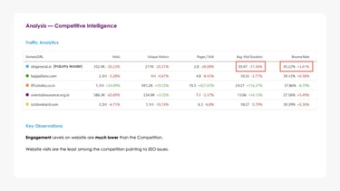
▶️ Did a competitive audit of insurance sites in India.
What we learned..
Indian users don’t buy insurance the way e-commerce works. They fall into 3 groups:
People who know what they want — they come, buy, and leave.
Price-sensitive shoppers — they compare, hesitate, and often drop off.
Value-focused users — they take time, read details, and are ready to pay more.
My Process..
Our first design had solid logic and clean screens.
But the pitch didn’t land.
Too many voices in the room. Questions came from all sides. I couldn’t tell the story clearly. That was the low point.
But it taught me something: great design isn’t enough you have to sell the story.
lesson learned
For the second round, I didn’t just design better. I spoke better. Same homepage. But this time, I presented it differently to each team:
To marketing: "Your campaigns land here - the hero section is your conversion zone."
To compliance: "We’ve surfaced key legal info clearly, so users aren't misled."
To sales: "This section reduces steps to get a quote by 30%."
To support: "These FAQs reduce top call drivers by design."
It worked. People aligned. We got the green light.
The Pitch!

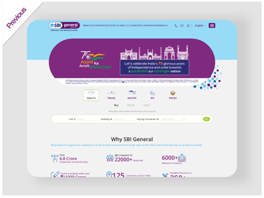
A few years later, I was invited again.
This time, things were smoother.
The teams knew me. I knew the landscape.
We had trust and shared pain points from before.
My storytelling got sharper. My decisions got faster.
We were designing with confidence, not just caution.
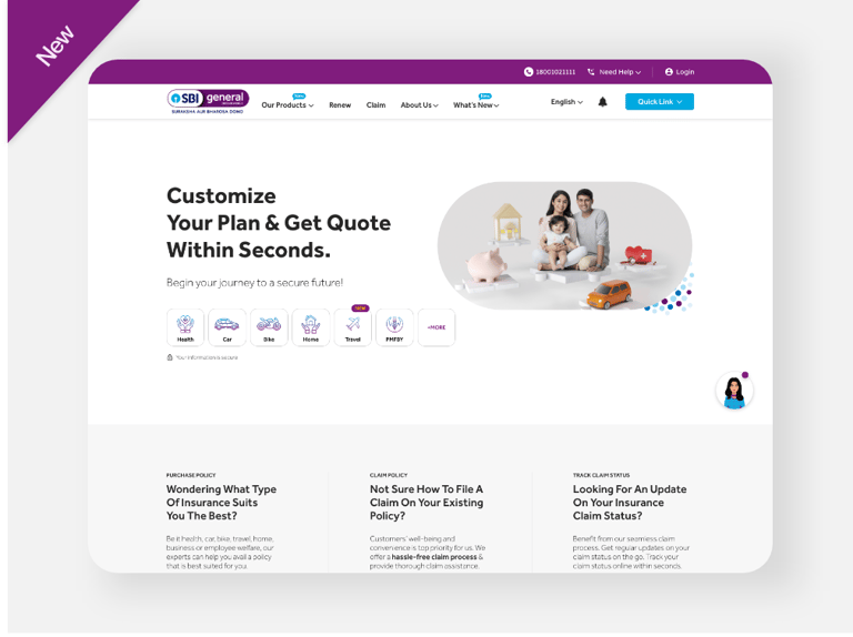
We launched. We had a few hiccups browser bugs, mobile responsiveness,
some content issues. But we worked as one team and fixed them quickly.
The Challenge:
Insurance Buying in India is Still Hard
Most people in India don’t trust insurance until they need it.
Too many options.
Too many terms.
Too little clarity.
People often give up midway or call an agent instead.
We studied real behavior:
People dropped off at “product selection”
They didn’t understand policy benefits
Most mobile journeys were painful
So we simplified.
We built the homepage like a guide not a catalog.
We cut jargon. Used everyday language.
We showed “next steps” clearly.
We added trust signals and timely nudges.
And slowly the numbers started improving.
More users stayed. More people completed their journeys.
And the team saw the homepage lot of attractions.
Every redesign teaches you something new.
But the second time? It teaches you what not to waste time on.
Over two redesigns across four years, I learned this:
Design isn’t what you deliver. It’s what you unlock.
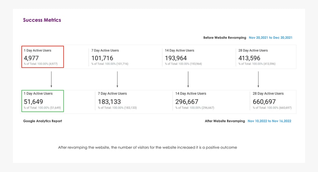
Launch, Learnings & Impact
+22% Increase in Journey Completion
More users successfully bought, renewed, or claimed insurance
-17% Drop in Homepage Abandonment
By cutting jargon and guiding users based on intent and product discovery.
( Recommendation flow)
95% device compatibility & Website Speed
After revamping the website landing page , the full loaded time reduced from 25.1s to 15.8s
How i redesigned the homepage for one of India’s
Top Insurance brands
From waiting rooms to video rooms: How COVID made me human designer
The first phase of the project was done in 3 months.
It took a lot of back and forth..