Reducing Quote-to-Policy Drop-Offs: A Case Study


How I Helped Reduce Quote-to-Policy Drop-offs by 35%:
A UX Case Study:
Working on this project with a top Indian insurer taught me a fundamental lesson about digital insurance experiences: Complex insurance flows aren't always the problem, unclear communication is.
The Challenge: A Leaky Funnel
When I first analyzed the insurance purchase flow i found:
🚫 62% of users were dropping off at the quote screen
The very moment they should have been most engaged
🚫 40% misunderstood the add-on
leading to confusion and abandonment
🚫 Trust was a major blocker
especially among users in tier 2 and tier 3 cities
The existing flow was technically sound but emotionally disconnected. Users were getting lost in insurance jargon, overwhelmed by choices, and ultimately losing confidence in their purchase decision.
What Were Users Really Thinking?
Through user interviews and session recordings, we uncovered the core issues:
↪ I don't understand what I'm actually paying for
This sentiment came up repeatedly.
The quote breakdown was dense with industry terms that meant nothing to everyday users.
↪ Why is this more expensive than what I saw online?
Users couldn't easily compare different payment options or understand the value of add-ons.
↪ Can I trust this company?
Particularly in smaller cities, users needed more reassurance and human connection during the purchase process.
The data confirmed what the interviews suggested:
Users weren't dropping off because the product was wrong. They were dropping off because the experience felt uncertain and impersonal.
Clarity, Comparison, and Connection
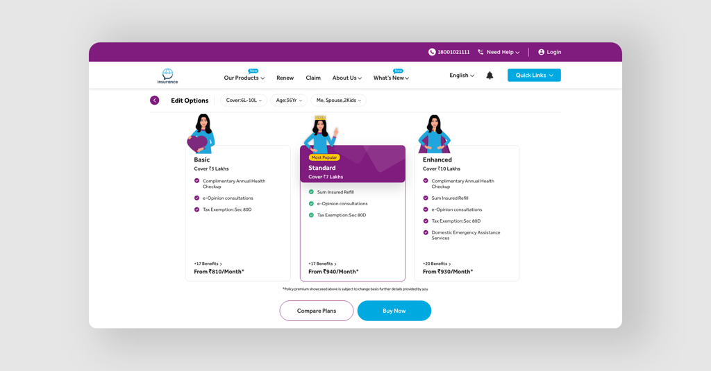
1. Simplified Quote Breakdown with Visual Cards:
Instead of presenting quotes as dense text blocks, we redesigned them as clean, scannable visual cards.
Each card clearly showed:
✅ The core benefit in simple language
✅ The premium amount prominently displayed
✅ A brief "why this matters" explanation
2. Instant Premium Comparison:
We added a toggle feature allowing users to instantly compare annual vs. monthly payment options. This transparency helped users make informed decisions and reduced the surprise factor that was causing drop-offs.
3. Plain Language + Social Proof:
We replaced insurance jargon with conversational language and added social proof badges like "Most Popular" and "Recommended for families like yours." These small touches made the experience feel more guided and trustworthy.
4. Human Touchpoints
At key drop-off points, we introduced a "Talk to Advisor" CTA. This wasn't about pushing sales
it was about offering reassurance when users needed it most. The feature was particularly effective in tier 2 and tier 3 cities where personal relationships matter more in financial decisions.
The Results: Trust Translates to Conversions
The impact was immediate and significant:
✅ 35% increase in quote-to-policy conversion.
✅ More users were completing their purchases
✅ 2x improvement in user trust based on post-purchase feedback surveys
But beyond the numbers, the qualitative feedback told the real story. Users described the new experience as "clear," "helpful," and "trustworthy"exactly the emotions we wanted to evoke during such an important financial decision.
Key Takeaways for Insurance UX
This project reinforced several crucial principles for designing insurance experiences:
✅ Transparency builds trust faster than features. Users don't need more options, they need to understand the options they have.
✅ Local context matters. What works in metro cities might not resonate in smaller towns. The "Talk to Advisor" feature performed 3x better in tier 2/3 cities compared to metros.
✅ Simplicity scales. The cleaner quote cards didn't just improve conversions, they also reduced support tickets by 25% as users had fewer questions about their policies.
Digital Designer | Ex-Creative Director @ Mantra Labs
Worked with India’s Top Insurance Brands, Driving 2× Revenue Growth | 22K+ on YouTube
I help build web & mobile apps for SaaS & Insurance.
Specializing in interaction design, business-first UX, and concept storytelling — with a strong focus on BFSI.